Introduction
In APEX we can create “Percentage Bars” within a report. This can be achieved using HTML Code in your Report SQL Query.
Steps To Follow
Step1:
Create your report:
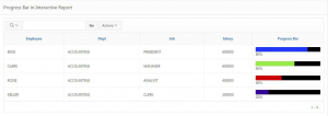
Create an Interactive or Classic Report using SQL query :
SELECT CASE
WHEN COLUMN <= 30
THEN ‘<div class=”a-Report-percentChart” style=”background-color:#000000;width:100%;”><div class=”a-Report-percentChart-fill” style=”width:’
|| COLUMN|| ‘% ; background-color: 330099;”></div><span class=”u-VisuallyHidden”>’
|| COLUMN || ‘</span></div>’ || COLUMN || ‘%’
WHEN COLUMN BETWEEN 30 AND 50
THEN ‘<div class=”a-Report-percentChart” style=”background-color:#000000;width:100%;”><div class=”a-Report-percentChart-fill” style=”width:’
|| COLUMN || ‘% ; background-color:CC0000;”></div><span class=”u-VisuallyHidden”>’
|| COLUMN || ‘</span></div>’ || COLUMN || ‘%’
WHEN COLUMN BETWEEN 55 AND 70
THEN ‘<div class=”a-Report-percentChart” style=”background-color:#000000;width:100%;”><div class=”a-Report-percentChart-fill” style=”width:’
|| COLUMN || ‘% ; background-color:#99eb47;”></div><span class=”u-VisuallyHidden”>’
|| COLUMN|| ‘</span></div>’|| COLUMN|| ‘%’
END AS “Progress bar”
FROM Table
Note:
- Use CASE Statement to display different colors for the bars based on percentage.
- Value of the Column apex_util.html_pct_graph_mask must be between 0 and 100.
Step2:
Set the Report Bar column to Standard Report Column
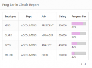
Output:
In this report we’re using the employees percentage of salary within their department.
Note : If you want same color for the bar then use the same query without Case Statements.
Call To Action
For Oracle apex development and customization please do contact our company website https://doyensys.com/
Conclusion
By following above steps we can create Percentage Bars within a report.
