1. Overview
Responsive Reports can be created in Oracle Apex Classic Reports. Standard Oracle APEX which shows the tabular format of the dataset doesn’t support the responsiveness as the device size changes.
2. Technologies and Tools Used
The following technology has been used to achieve this in oracle.
3. Use Case
It can be used in all applications.
4. Steps
Steps to be followed
Step 1: Create a report template.
Step 2: Edit the Template.
Step 3: Create a Classic Report.
Step 4: Set the template.
Step 5: Edit CSS of the report.
5. Create a report template
- Go to Shared components
- Select Report Template
- Create a new template as a copy of “Standard” template

6. Edit the Template
Add the code to Before Rows: Add responsive class to the table tag.
<div class=”t-Report #COMPONENT_CSS_CLASSES#” id=”report_#REGION_STATIC_ID#”
#REPORT_ATTRIBUTES# data-region-id=”#REGION_STATIC_ID#”>
<div class=”t-Report-wrap”>
<table class=”t-Report-pagination” role=”presentation”>#TOP_PAGINATION#</table>
<div class=”t-Report-tableWrap”>
<table class=”t-Report-report responsive-table” aria-label=”#REGION_TITLE#”>
Add the code to Column Template:
<td data-th=”#COLUMN_HEADER_NAME#” class=”t-Report-cell” #ALIGNMENT# headers=”#COLUMN_HEADER_NAME#”>#COLUMN_VALUE#</td>
7. Create a Classic Report
Create a Classic Report named “Responsive Report”
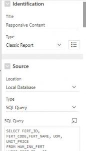
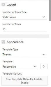
8. Set the template
Go to Report Attributes and set the template to “Responsive”
9. Edit CSS of the report
For better view add the following code to page inline CSS:
.responsive-table {
margin: 0 0;
min-width: 300px;
}
.responsive-table th {
display: none;
}
.responsive-table td {
display: block;
}
.responsive-table td:first-child {
padding-top: .5em;
}
.responsive-table td:last-child {
padding-bottom: .5em;
}
.responsive-table td:before {
content: attr(data-th) “: “;
font-weight: bold;
width: 6.5em;
display: inline-block;
}
@media (min-width: 480px) {
.responsive-table td:before {
display: none;
}
}
.responsive-table th, .responsive-table td {
text-align: left;
}
@media (min-width: 480px) {
.responsive-table th, .responsive-table td {
display: table-cell;
padding: .25em .5em;
}
.responsive-table th:first-child, .responsive-table td:first-child {
padding-left: 0;
}
.responsive-table th:last-child, .responsive-table td:last-child {
padding-right: 0;
}
}
.responsive-table {
/*background: #34495E;
color: #fff;*/
border-radius: .4em;
overflow: hidden;
}
.responsive-table tr {
border-color: #46637f;
}
@media (min-width: 480px) {
.responsive-table th, .responsive-table td {
padding: 1em !important;
}
}
.responsive-table th, .responsive-table td:before {
color: #d55;
}
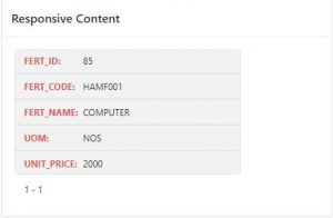
Reduce the device width and check the report for the following output :
