Introduction:
Interactive reports are a cornerstone of Oracle APEX applications, allowing users to explore data dynamically. However, adding visual flair can make these reports not only functional but also more engaging. In this blog, I’ll demonstrate how to apply hover and zooming effects to your Oracle APEX interactive reports using CSS, giving them a modern and interactive feel.
The following technologies have been used to implement this requirement.
Why we need to do:
Hover and zoom effects are subtle yet effective ways to draw attention to specific rows in your report, making the data more interactive and visually appealing. These effects improve the user experience by highlighting data points as users hover over them, making the information more accessible.
How do we solve:
Implementing the card zoom and hover effects in Oracle APEX involves the following steps:
Step 1: Create an interactive report using the employee table.
SQL Query:
select EMPNO,
ENAME,
JOB,
MGR,
HIREDATE,
SAL,
COMM,
DEPTNO
from EMP;
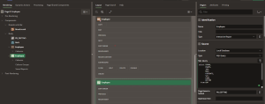
Page Designer->Body>> Region>> Interactive Report

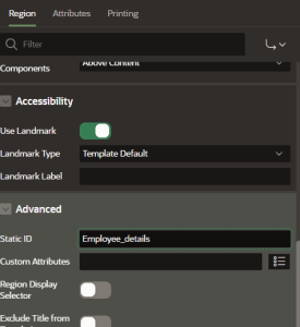
Step 2: Create static ID for the Interactive report as shown.
Region>>Report>>Advanced>>Static Id

Step 3: Add CSS in the page inline CSS
Add below CSS in your page>> inline CSS>> modify according to your need.

#Employee_details tbody tr { /* Static id of the report which we set in previous step*/
width: 30px;
height: 30px;
border-radius: 40%;
border: none;
background-color: lightcyan;
font-size: 20px;
font-weight: 100;
line-height: 1;
text-align: center;
vertical-align: middle;
transition: transform 0.5s ease,background-color 0.5s ease; ;
}
#Employee_details tbody tr:hover {
transform: translateY(-10px);
background-color: skyblue;
color:black;
}
Explaination:
#Employee_details tbody tr { … }: This selector targets all rows (<tr>) within the <tbody> of the #Employee_details table.
width: 30px; height: 30px;: Sets the width and height of each row to 30px, creating a compact, square-like appearance.
border-radius: 40%;: Rounds the corners of the rows, giving them an elliptical or pill-like shape.
border: none;: Removes any border around the rows.
background-color: lightcyan;: Sets a light cyan background color for the rows.
font-size: 20px; font-weight: 100; line-height: 1;: Adjusts the text within the rows to a larger font size (20px), with a lighter weight (100) and tight line spacing.
text-align: center; vertical-align: middle;: Centers the text horizontally and vertically within each row.
transition: transform 0.5s ease, background-color 0.5s ease;: Adds a smooth transition effect that lasts 0.5 seconds when the rows transform or change their background color.
#Employee_details tbody tr:hover { … }: This selector defines the styles when a row is hovered over.
transform: translateY(-10px);: Moves the row 10px upwards on hover, creating a subtle lift effect.
background-color: skyblue;: Changes the background color to sky blue when hovered.
color: black;: Sets the text color to black on hover.
Here, you can see the hover effects for your report.

Conclusion:
By incorporating card zoom and hover effects into your Oracle APEX application, you can significantly enhance its visual appeal and user interactivity. This simple yet effective technique, powered by Tailwind CSS, allows you to create a more engaging user experience. Experiment with different styles and effects to match your application’s theme and functionality.

