Introduction:
Turning a radio group into something that looks like tabs.To make a radio group look like tabs, you would typically style the radio buttons and their labels to resemble tab buttons. This involves using CSS to adjust the appearance, such as applying borders, background colors, and padding to create a tab-like appearance.
The following technologies has been used to achieve the same.
- Oracle APEX
- CSS
Why we need to do:
To achieve this, you begin by creating a radio group page item on a blank page. You then define the display and return values for the radio buttons, representing each section. Instead of refreshing the entire page, you opt for a dynamic action to show and hide content based on the user’s selection. To enhance the visual appeal, you configure the radio buttons to display as pill buttons and apply the “TABS” CSS class for consistent styling. Finally, you add custom CSS styles to make the radio buttons appear as tabs, giving the page a modern, user-friendly interface.
This approach improves user experience by providing a smooth and visually appealing way to navigate between sections, avoiding page reloads and making the application more efficient and responsive.
How do we solve:
- Step1: On a blank page, create page item with Type = Radio Group
- Step2: At the List of Values properties, provide values for both the display and return values.
- Step3: In the Settings, configure the number of columns as needed and set the Page Action to ‘Redirect and Set Value.’ If you prefer not to refresh the page, create a Dynamic Action instead.
- Step4: Under Appearance and Template Options, choose ‘Display as Pill Button’ for the Item Group Display setting.
- Step5: In the Appearance section, add ‘TABS’ to the CSS Classes
- Step6: Add the following CSS styles to format these buttons as tabs.
Code:
.TABS .t-Form-labelContainer {
display : none;
}
.TABS .apex-item-grid-row {
display : flex !important;
}
.TABS .apex-item-grid-row .apex-item-option {
margin : 0.5rem 6px 0.75rem 0;
}
.TABS .apex-item-grid-row .apex-item-option label {
border : 0;
background : transparent !important;
box-shadow : none !important;
font-size : 1rem;
font-weight : 600;
color : #444 !important;
padding : 0.6rem 0.75rem;
border-bottom : 8px solid #ededed;
outline : none !important;
}
.TABS .apex-item-grid-row .apex-item-option input:checked + label {
color : #000 !important;
border-bottom : 8px solid #5f5c58;
}
.TABS .apex-item-grid-row .apex-item-option label:hover {
color : #000 !important;
border-bottom : 8px solid #333 !important;
}
Conclusion:
Styling a radio group to resemble tabs offers significant advantages in user interface design. By mimicking tabbed navigation, this approach enhances the visual clarity and usability of applications, particularly in scenarios where segmented content or multi-step processes are involved. It provides users with intuitive navigation cues, allowing them to switch between sections or options effortlessly. Additionally, this design choice can streamline complex interfaces by reducing clutter and cognitive load, ultimately improving the overall user experience and engagement with the application.
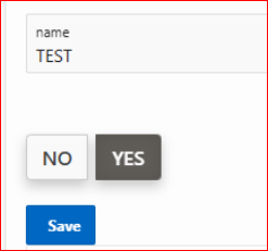
Screenshots :