Introduction
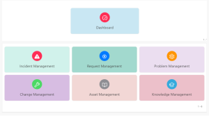
In Oracle APEX, “Enhanced Dashboard Cards” provide users with a visually appealing and intuitive way to display key metrics and information at a glance. These cards can be customized with different colors, icons, and labels to represent various categories or functions, making it easy for users to navigate and access essential data. The layout can be organized in a grid format, ensuring that information is presented in a clear and structured manner. Here’s a basic guide on how you might create Enhanced Dashboard Cards in Oracle APEX.
The following technologies has been used to achieve the same.
- Oracle APEX
Why we need to do
- Employee Management Dashboard: Used to quickly access key employee-related functions such as profiles, attendance records, and performance reviews, enhancing the efficiency of HR operations.
- Project Management System: Facilitates the organization and management of ongoing projects, tasks, and resource allocation, aiding project managers in maintaining project timelines and resource efficiency.
- E-commerce Admin Panel: Enables the monitoring and management of sales, product inventories, and customer orders, supporting smooth operations and decision-making in e-commerce environments.
How do we solve
Step 1: Define the HTML for the Card
Prepare the Card HTML Code:
Navigate to Shared Components → User Interface → Templates in Oracle APEX.
Locate or create a new template for defining the card structure.
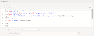
Define the HTML structure for the card using the following code:
<li class=”t-Cards-item #CARD_MODIFIERS#”>
<div class=”t-Card”>
<a href=”#CARD_LINK#” class=”t-Card-wrap” style=”background-color: #CARD_COLOR#;”>
<div class=”t-Card-icon”>
<span class=”t-Icon #CARD_ICON#”><span class=”t-Card-initials” role=”presentation”>#CARD_INITIALS#</span></span>
</div>
<div class=”t-Card-titleWrap”>
<h3 class=”t-Card-title”>#CARD_TITLE#</h3>
</div>
</a>
</div>
</li>
In this HTML code:
#CARD_ICON# is a placeholder for the class of the card’s icon.
#CARD_INITIALS# is a placeholder for any initials or additional icon-related data.
#CARD_TITLE# is a placeholder for the card’s title.
Highlight Differences Between Old and New Code:
Background Color:
- New Code: Incorporates the ability to customize the card’s background color by using style=”background-color: #CARD_COLOR#;”. This provides a more dynamic and visually appealing card design.
- Old Code: Did not allow background color customization, resulting in a static appearance.
Card Body Content:
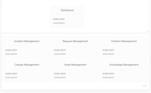
- New Code: Streamlines the card by removing the card body section, which previously included #CARD_TEXT# and #CARD_SUBTEXT#. This makes the card cleaner and more focused on the icon and title.
- Old Code: Included a card body section with additional descriptive text and information, making the card more complex and potentially cluttered.
Structural Layout:
New Code: Features a simpler and more straightforward layout that emphasizes the card’s title and icon. This results in a cleaner design with less visual clutter.
Old Code: Had a more detailed structure with extra text and information fields, which could make the card appear busier and less focused.
Step 2: Create and Configure a Classic Report for Dynamic Card Data
Create a Classic Report:
- On your page, create a new Classic Report region to dynamically populate the card data.
- Set the Source Type of the report to SQL Query.
- Use the following SQL query to provide the data for the cards:
SELECT
1 AS DISPLAY_ORDER,
apex_util.prepare_url(‘f?p=’ || :app_id || ‘:124:’ || :app_session || ‘::’ || :DEBUG || ‘::’ || ‘P124_TYPE:’ || ‘Incident’) AS CARD_LINK,
‘fa fa-exclamation-triangle’ AS CARD_ICON,
‘Incident Management’ AS CARD_TITLE,
‘#D1F2EB’ AS CARD_COLOR
FROM DUAL
UNION
SELECT
2 AS DISPLAY_ORDER,
apex_util.prepare_url(‘f?p=’ || :app_id || ‘:124:’ || :app_session || ‘::’ || :DEBUG || ‘::’ || ‘P124_TYPE:’ || ‘Request’) AS CARD_LINK,
‘fa fa-registered’ AS CARD_ICON,
‘Request Management’ AS CARD_TITLE,
‘#A2D9CE’ AS CARD_COLOR
FROM DUAL
UNION
SELECT
3 AS DISPLAY_ORDER,
apex_util.prepare_url(‘f?p=’ || :app_id || ‘:124:’ || :app_session || ‘::’ || :DEBUG || ‘::’ || ‘P124_TYPE:’ || ‘Problem’) AS CARD_LINK,
‘fa fa-cog’ AS CARD_ICON,
‘Problem Management’ AS CARD_TITLE,
‘#EBDEF0’ AS CARD_COLOR
FROM DUAL;
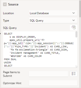
- This query generates card configurations including link, icon, title, and color dynamically based on the results.
Step 3: Apply and Customize the Report Layout
Select the Template and Layout:
- In the Attributes Tab of your Classic Report, select the New template you created for card customization. This ensures the card design matches the new specifications.
- Choose your preferred layout option in the Layout section to determine how the cards will be displayed on the page.
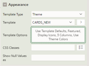
Save and Preview:
- Click Save to apply the changes.
- Run the page to see how your customized cards appear. Verify that the cards are displayed as expected with all dynamic data rendered correctly.
Conclusion
Enhanced Dashboard Cards in Oracle APEX offer a more dynamic and engaging way to display key metrics. By using customization templates and dynamic SQL queries, you can create visually appealing cards that make important information easily accessible. This improves user experience and helps in making informed decisions quickly.
Before Customizing Cards:
After Customizing Cards:
