Overview:
This blog talks about organization charts in Oracle Apex using third-party libraries or plugins since Oracle APEX does not have a built-in organization chart component.
Technologies and Tools Used:
The following technologies have been used to implement this requirement.
- SQL
- Oracle Apex
- JavaScript
Use Case:
- Organizations want a visual representation of their hierarchical structure, showing the reporting relationships between employees.
- Providing a dynamic and interactive organization chart that displays the hierarchy allows users to navigate through different levels and understand the chain of command.
- Implementing an organization chart with interactive tooltips or pop-ups that display detailed information about each employee, including their position, contact details, and relevant attributes.
Architecture:
The following steps are explained in detail:
Step 1: Create an application with a blank page and create a dynamic PL/SQL content region.
Step 2: Write the script below and change the data source according to your requirements. This will display the employee with their image and designation.
I don’t have any images to showcase; I have already created a Rest API for fetching images from databases, and using that, I am showing the test image.
Scenario:
- Requirement is to have Organization Chart where for a given employee,it should show his reporting structure and the reportee details, and when the user double-clicks, it will uncollapse the details for each nodes available as a child.
Customized Code here,
DECLARE
l_empno number:=23;
Begin
Htp.P(‘<div id=”chart_div”></div>’);
Htp.P(
q'[
<script type=”text/javascript” src=”https://www.gstatic.com/charts/loader.js”></script>
<script type=”text/javascript”>
google.charts.load(‘current’, {packages:[“orgchart”]});
google.charts.setOnLoadCallback(drawChart);
function drawChart() {
var data = new google.visualization.DataTable();
data.addColumn(‘string’, ‘Name’);
data.addColumn(‘string’, ‘Manager’);
data.addColumn(‘string’, ‘ToolTip’);
data.addRows([
]’
);
For i In (
SELECT ‘<img src=”https://apex.oracle.com/pls/apex/apex_rest/bg/bg_id?id=’||l_empno||'” height=”100″ width=”100″> </img>’|| e2.ename||'<div style=”color:red; font-style:italic”>’||e2.job||'</div>’ AS parent ,
‘<img src=”https://apex.oracle.com/pls/apex/apex_rest/bg/bg_id?id=’||l_empno||'” height=”100″ width=”100″> </img>’ ||e1.ename ||'<div style=”color:red; font-style:italic”>’||e1.job||'</div>’ as child,
Case When Count(*) Over () = Row_Number() Over (Order By 1) Then ‘Y’ End last_row
FROM emp_fk e1
join
emp_fk e2
ON e1.mgr = e2.empno
— WHERE E1.MGR IS NULL
START WITH
e1.ENAME = :APP_USER
CONNECT BY NOCYCLE PRIOR e1.EMPNO = e1.MGR
)
/* to get reportee and reporting structure for a login user*/
Loop
Htp.P(‘[”’ || i.child||”’,”’ || i.parent || ”’,””]’ || Case When i.last_row Is Null Then ‘,’ End);
End Loop;
Htp.P(
q'[
]);
var chart = new google.visualization.OrgChart(document.getElementById(‘chart_div’));
chart.draw(data, {allowHtml:true,allowCollapse:true});
for (var i = 0; i < data.getNumberOfRows(); i++) {
chart.collapse(i, true);
}
}
</script>
]’
);
End;
Step 3: Adding some css for making visually appealing charts.
Add the below code in Page à inline css
#chart_div .google-visualization-orgchart-linebottom {
border-bottom: 4px solid black;
}
#chart_div .google-visualization-orgchart-lineleft {
border-left: 4px solid black;
}
#chart_div .google-visualization-orgchart-lineright {
border-right: 4px solid black;
}
#chart_div .google-visualization-orgchart-linetop {
border-top: 4px solid black;
}
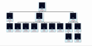
Screen Shot:
Required Outcome is given below,
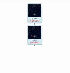
Code 1: Output:
Here, I am logging in as Employee “king” ,I am only getting the details related to “king”
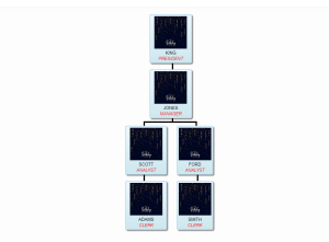
Code 2:Output:
Here I am login as “Jones”, I am getting reporting manager and reportee structure.
 If you double-click the “Jones” node, you can see the reporting structure by double-clicking the child node.
Conclusion:
In conclusion, incorporating the organization chart into your Oracle APEX application adds significant value by improving data visualization, fostering interactivity, and enhancing overall organizational transparency. It is a powerful feature that contributes to a more user-friendly and effective application for managing and understanding organizational structures.