Introduction: –
Responsive screen size management in Oracle APEX is essential for delivering an optimal user experience across various devices. With increasing use of mobile devices and varying screen resolutions, it is crucial that applications are adaptable. APEX provides tools and features that allow dynamic resizing of elements to match the screen size. This flexibility ensures that users can access the application seamlessly, regardless of device or resolution. By implementing responsive design principles, APEX applications become more versatile and user-friendly.
The following technologies have been used how to expand the size in Oracle APEX.
- Javascript
- Oracle APEX
Why we need to do: –
As users access applications from a wide range of devices, including smartphones, tablets, and desktops, a static layout may not provide an optimal experience. Responsive design allows APEX applications to automatically adjust to different screen sizes, enhancing usability. It helps in reducing the need for horizontal scrolling or zooming, ensuring content is displayed properly on all devices. Moreover, it improves the overall accessibility of applications and aligns with modern web design trends. Without responsiveness, users may experience frustration, leading to decreased engagement and satisfaction.
How do we solve:
The following steps will help to expand the screen size using Oracle APEX,
Step 1: Create a list in navigation bar
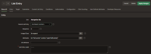
Step 2:Create a region and a sub region in global page
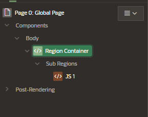
Step 3: In the JS1 Sub Region, In Header text implement the javascript code.
Code:
<script>
function replaceIcon() {
var iconElement = document.getElementById(‘full-screen’);
if (iconElement.classList[2] === ‘fa-expand’)
{
iconElement.classList.remove(‘fa-expand’);
iconElement.classList.add(‘fa-compress’);
}
else {
iconElement.classList.remove(‘fa-compress’);
iconElement.classList.add(‘fa-expand’);
}
}
function openFullScreen()
{
replaceIcon();
var elmnt = document.documentElement;
if (document.fullscreen)
{
closeFullScreen();
}
else if (elmnt.requestFullscreen)
{
elmnt.requestFullscreen();
}
else if (elmnt.webkitRequestFullscreen)
{
elmnt.webkitRequestFullscreen();
}
// IE 11
else if (elmnt.msRequestFullscreen) {
elmnt.msRequestFullscreen();
}
replaceIcon(this);
}
function closeFullScreen()
{
if (document.exitFullscreen)
{
document.exitFullscreen();
}
// FOR SAFARI BROWSER
else if
(document.webkitExitFullscreen)
{
document.webkitExitFullscreen();
}
// FOR IE 11
else if
(document.msExitFullscreen)
{
document.msExitFullscreen();
}
}
</script>
Conclusion:
Implementing responsive screen size management in Oracle APEX is crucial for creating flexible and adaptive applications. It ensures that users have an excellent experience across all devices. By utilizing APEX’s built-in responsive features, developers can save time and effort in design. A responsive design also improves accessibility and user satisfaction. Ultimately, making applications mobile-friendly and adaptable to various screen sizes results in increased user retention and application success.
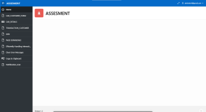
On Clicking the Expand button in the Navigation Bar
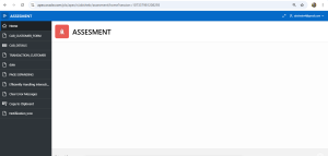
Clicking the Expand button will return the screen to its default size.