Introduction
As a data analyst, you’re likely familiar with the importance of visualizing data to gain insights and make informed decisions. One of the most powerful visualization tools in Power BI is the scatter plot. In this blog, we’ll explore the world of scatter plots and show you how to create them in Power BI.
Why we need to do
A scatter plot is a great tool to use when you want to show the relationship between two quantitative variables. This could be sales and profit, weight and age, or any other two numerical variables. Scatter plots are particularly useful when you want to identify patterns, correlations, or trends between these variables.
Real-Life Scenario
As a sales manager at a retail company, I want to analyze the relationship between sales and profit to identify trends and patterns that can help me make informed decisions. I decide to use a scatter plot in Power BI to visualize the relationship between these two variables.
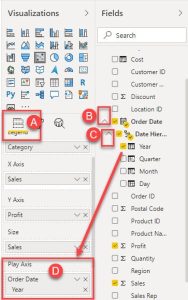
Here are some examples of how Play Axis can be combined with scatter plots for deeper insights:
| Business Scenario | X-axis | Y-axis | Play Axis | Insights |
| Product Performance | Sales Quantity | Profit Margin | Date | Track product performance over time, identify trends in sales and profitability. |
| Customer Segmentation | Spending Amount | Purchase Frequency | Customer Age | Analyse how customer spending and purchasing behavior evolve with age |
| Market Analysis | Market Share | Customer Satisfaction | Quarter | Monitor market share and customer satisfaction trends over time. |
| Sales Territory Analysis | Sales Revenue | Sales Growth | Region | Compare sales performance across regions over time. |
How do we solve
To create a basic scatter plot in Power BI, follow these steps
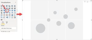
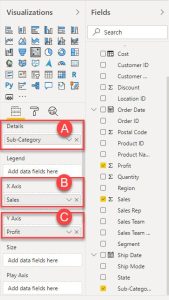
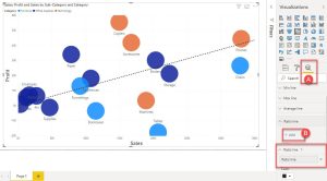
1.Click on the “Scatter Chart” icon in the Visualizations pane.
2.Drag the “Sales” column to the X-axis and the “Profit” column to the Y-axis.
3.Drag the “Sub-Category” column to the Details field.
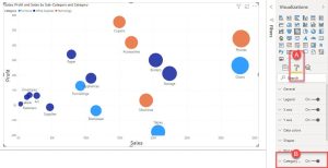
4.Click on the “Format” pane and adjust the chart as needed.
Formatting Your Scatter Plot
Axis Customization: Adjust axis scales, units, and labels for accurate representation.
Gridlines: Use gridlines to improve readability and data alignment.
Chart Title and Axes Labels: Provide clear and concise titles and labels.
Advanced Scatter Plot Features
Trend Lines: Add linear, exponential, logarithmic, polynomial, or power trend lines to identify patterns.
R-squared Value: Display the R-squared value to measure the strength of the correlation between variables.
Quadrants: Create quadrants to categorize data points based on specific criteria.
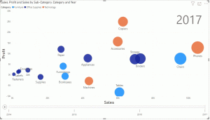
Bubble Charts: Add a third dimension to the scatter plot by using bubble size to represent a third variable.
Animating Your Scatter Plot
Play Axis: Visualize data changes over time, revealing trends and patterns.
Animation Speed: Control the animation speed for optimal viewing experience.
Data Point Trails: Add data point trails to emphasize movement and direction.
By combining these techniques, you can create compelling and informative scatter plots that effectively communicate your data story.
Conclusion
In this blog, we’ve explored the world of scatter plots in Power BI. From creating a basic scatter plot to enhancing it with additional fields and formatting options, we’ve covered it all. Whether you’re a seasoned data analyst or just starting out, scatter plots are a powerful tool to add to your toolkit.