Introduction: –
POWER BI, a leading tool in business intelligence, has embraced AI to offer advanced visual capabilities. This integration brings data to life, making complex information easily understandable and highly accessible. Whether you are a business analyst, data scientist, or just keen on the power of data, exploring AI visuals in POWER BI can transform the way you interpret and leverage information. In this blog, we’ll delve into how AI-powered visuals elevate data analysis and decision-making processes. Let’s embark on this exciting journey to uncover the synergy between AI and data visualization in POWER BI.
The following technologies have been used to achieve the same: –
- POWER BI
Why we need to do: –
Enhanced Data Visualization
In the era of big data, having access to effective data visualization tools is essential. AI visuals in POWER BI transform complex datasets into clear, understandable visuals that amplify comprehension and engagement. This dynamic capability ensures that every dataset is not only visually appealing but also maximized for insight extraction, making it easier for users of all skill levels to interpret data briefly
Improved Decision-Making
- The incorporation of AI visuals in POWER BI significantly enhances decision-making processes within an organization. By automating data analysis, it reduces the likelihood of human error and provides a more accurate basis for decisions.
- These AI driven visuals offer predictive insights, which are crucial in forecasting future trends and behaviors, allowing companies to strategize more effectively.
- Furthermore, by presenting complex data in an accessible way, these visuals ensure that stakeholders can make informed decisions quickly, boosting efficiency and effectiveness in strategic planning and operational adjustments.
How do we solve:
1.Key Influencer Visual
The key influencers visual helps you understand the factors that drive a metric that interests you. It analyzes your data, ranks the factors that matter, and displays them as key influencers.
For example: If I want to increase the profit of the company, then what are the variables or factors that need to be assessed or to be met in order to increase the profit.
The key influencers visual is a great choice if you want to:
- See which factors affect the metric being analyzed.
- Contrast the relative importance of these factors. For example, do short-term contracts affect churn more than long-term contracts?
There are two tabs Key Influence & Top Segments. Key influencers show you the top contributors to the selected metric value. Top segments show you the top segments that contribute to the selected metric value. A segment is made up of a combination of values.
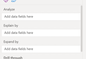
- Set Up: Drag and drop the Key Influencers visual into your Power BI report canvas.
- Analyze: Drag the metric column you want to analyze into the “Analyze” field.
- Explain by: Drag the potential influencing factors into the “Explain by” field. Power BI will automatically compute the key factors influencing the analyzed metric.
- Expand by: (Optional) Add additional fields to drill down into specific categories if you want more detailed insights.
Using the Key Influencers visual in Power BI to analyze the factors influencing whether individuals have a house loan (“houseloan” set to “yes”).
If you click the dropdown you are going to see yes or no. Having all the values of the selected metric. The key contributors are analyzed by selecting any value from the Dropbox.
Key Observations from the Visual:
1.Top Influencers:
o Loan Default: The likelihood of having a house loan is 1.42 times higher when the individual has not defaulted on a loan (“Loan Default is no”).
o Education: Individuals with secondary education are 1.23 times more likely to have a house loan.
o Job Classification: Those in White Collar job classifications are 1.07 times more likely to have a house loan.
o Marital Status: Being married increases the likelihood by 1.06 times.
2.Explanation:
o The Key Influencers visual helps identify which factors most significantly affect the likelihood of the outcome you’re analyzing—in this case, whether someone has a house loan. The visual uses statistical measures to identify the strength and direction of each factor’s influence.
3.Visualization Features:
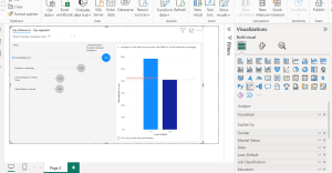
o The bar chart on the right shows the average likelihood of having a house loan for different values of a selected influencer, in this case, “Loan Default.” It indicates that individuals who haven’t defaulted on a loan are more likely to have a house loan than those who have.
o Similarly, you select another Key influencer to check how the visualization will be affected.
Now moving onto the next tab which is Top Segments.
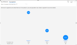
This tab provides a breakdown of segments within your data based on the likelihood of a particular outcome, in this case, whether individuals have a house loan (“houseloan” is “yes”).
Key Information Displayed:
Segments Identified:
The visual has identified three key segments within the data and ranked them by the percentage of individuals with a house loan and population size.
Segment Details:
- Segment 1: 72.6% of the population in this segment have a house loan, with a population count of 310.
- Segment 2: 66.7% of the population in this segment have a house loan, with a population count of 339.
- Segment 3: 64.7% of the population in this segment have a house loan, with a population count of 484.
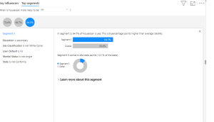
In this segment it shows what are the factors & how the factors are influencing the house loan to be yes
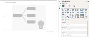
2.Decomposition Tree Visual
You can visualize data from various angles, and it automatically combines data, allowing you to delve deeper into the dimensions you select. It’s also an artificial intelligence (AI) visualization, so you can ask it to find the next dimension to drill down into based on certain criteria. This tool is valuable for ad hoc exploration and conducting root cause analysis.
When is it appropriate to utilize a decomposition tree?
- When the data is arranged in multiple nested levels or dimensions.
- Whenever you need to access data fields in any sequence.
- Whenever you require the analysis of data in a specific sequence or structure.
The visualization requires two types of input:
Analyze – the metric you would like to analyze. It must be a measure or an aggregate.
Explain By – one or more dimensions you would like to drill down into.
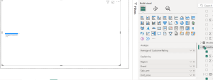
I want to examine the average customer rating based on region, brand, sales amount, and unit price.
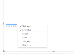
Once we add these fields or dimensions, a plus sign will appear. By clicking on the plus sign, you will be presented with several options to choose from, including high and low values. These are our measurements.
High Value: Considers all available fields and determines which one to drill into to get the highest value of the measure being analyzed.
Low Value: Considers all available fields and determines which one to drill into to get the lowest value of the measure being analyzed.
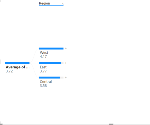
Initially, I am interested in observing the distribution of this customer rating on a regional basis. I can select the region, and it will be sorted according to its weight. Higher values would appear at the top.
This process can be repeated by choosing another node to drill into.
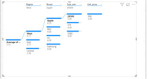
Clicking on any node will provide detailed information. For instance, clicking on the east region will give you knowledge like that of the west region.
You can click on the cross sign on the above if you want to go back and click another factor to be analyzed by.
Another point to consider is that when you select it, a lock button appears on top. Therefore, at times, you may not want users to have access. When developing an app or other project, it is important to select the initial value personally. IF You want to avoid the user selecting these values because I am aware that this is the top split. These are the locks that Microsoft offers for that purpose.
3.Smart Narrative
Smart narrative visualization helps you provide a quick text summary of visuals and reports. It provides relevant innovative insights that you can customize.
Utilize intelligent summaries in your reports to highlight main points, identify patterns, and tailor the content and presentation for a particular readership. By including a live Power BI report page in PowerPoint, you can avoid inserting a static screenshot of the report’s main points and instead include dynamic narratives that automatically update each time the report is refreshed. Your audience can utilize the summaries to comprehend the information, access important points more quickly, and articulate the data to others.
There are 3 types to add smart narrative visuals:
- A smart narrative for a page
- A smart narrative for a visual
- A smart narrative icon to a visual
1.Smart narrative for a page
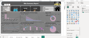
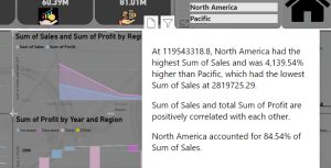
Select the report canvas, then in the Visualizations pane, select the Smart narrative icon to automatically generate a summary. You see a narrative based on all the visuals on the page. For example, in the sample file, smart narratives can automatically generate a summary of the report’s visuals
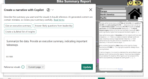
I generated a recap of the report’s visuals using Smart Narrative. There are two choices available: Copilot and Custom.
2.Smart Narrative for a visual
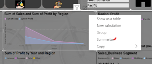
- Right-click the visual and select Summarize.
- You can choose to pin the summary to the report page.
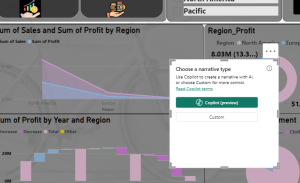
It will ask you about the option. Click any. I will choose Custom.
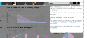
The smart narrative summary is highly customizable. You can edit or add to the existing text by using the text box commands. For example, you can make the text bold or change its color.
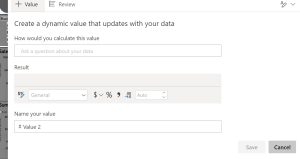
To customize the summary or add your own insights, use dynamic values. You can map text to existing fields and measures or use natural language to define a new measure to map to text. For example, to add information about the number of returned items in the sample file, add a value.
A summary is dynamic. It automatically updates the generated text and dynamic values when you cross-filter.
3.Smart Narrative icon to visual
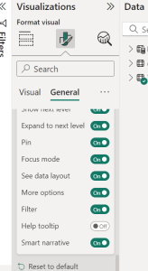
An optional icon can be included in the header of a visual to activate an on-demand summary of its contents. Include it to ensure that results can be transmitted to all assistive technology devices for accessibility purposes. You have the option to activate it in the Format section of specific visuals or include it in your personalized theme file for the selected visual types. Choose a visual and then go to the Format pane to select General. Extend the Header icons section, then extend the Icons section, and enable Smart narrative.
When your report readers hover over that visual, they can see and select the Smart narrative icon, to expose a text explanation of the visual.
4.Q&A Visual
The Q&A visual feature enables users to pose questions in natural language and receive responses in visual format. Business professionals can utilize the Q&A feature to promptly receive responses based on their report data. Designers can utilize the Q&A features to rapidly generate visuals.
The Q&A visual can interpret a variety of question types, from simple counts to complex aggregations, and it supports customization to refine answers. You can even teach the Q&A visual new terms to improve its understanding of your unique data context.
Key Features:
Natural Language Querying: Easily ask questions and get instant visualizations.
Customization: Refine visual responses to match your data insights needs.
Teaching Q&A: Improve its accuracy by defining specific terms and phrases.
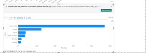
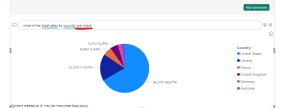
To customize your visual, select a suggested question or enter text in the Q&A question field, where it says Ask a question about your data. In this example, we select the suggestion top sales by country
Power BI determines the appropriate visual type based on the selected suggestion or entered text. In our example, Power BI determines that a map visual is best suited to display the data.
You have the option to direct Power BI to utilize a particular visual format by including the format within the text entered in the Q&A question section.
Remember that not every visual type is suitable for showcasing every kind of data. Some visuals are only appropriate for certain types of data.
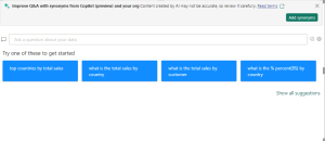
If you are not sure which question to pose or which text to utilize, click on the Show all suggestions link on the report canvas to view all suggestions provided by Power BI. Another method involves examining the data fields within the Data pane. You can find inspiration for topic-related inquiries and distinctive vocabulary for the semantic framework to incorporate into your search.
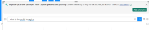
Start to enter a question in the Q&A question field.
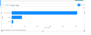
With Power BI’s help, we’re able to ask a question with all recognizable terms. Power BI displays the results as a bar chart.
When additional text is input for the question in Power BI, the tool will alert you if it is unable to comprehend the question and help. The recommended terms are highlighted in blue.
In Power BI’s Q&A feature, synonyms are alternative words or phrases that you define to help the Q&A visual understand the data better. By adding synonyms, you can teach the Q&A visual to recognize different terms users might use to refer to the same thing. For example, if you have a column named “Revenue,” you can add synonyms like “Sales” or “Income,” so that the Q&A visual can understand these terms when users ask questions. This enhances the Q&A experience by making it more intuitive and user-friendly.
Conclusion:
In today’s rapidly evolving data landscape, the benefits of integrating AI visuals into POWER BI are unmistakable. These advanced tools not only enhance the aesthetic appeal of your data presentations but also improve the depth and accuracy of insights you can derive. By automating complex data analysis tasks, AI visuals free up valuable time for businesses to focus on strategy and innovation. We can expect AI-enabled business intelligence tools like POWER BI to continue shaping the future of data-driven decision making, making it more intuitive, insightful, and accessible to all levels of users. Embracing these tools today means staying ahead in the competitive market of tomorrow.