Blog / Application Development
Seeing Inside the Black Box: Building a Visualizer for RAG Chunks
Introduction / Issue
Anyone who has worked with a Retrieval-Augmented Generation (RAG) pipeline has run into the same frustrating moment: the model returns an answer, and somewhere behind it a set of “chunks” were retrieved from a vector database to ground that answer — but we, the builders, have almost no way of actually seeing what those chunks are, how they were formed, or why they were chosen over the hundreds of other chunks sitting in storage.
We don’t always understand the chunks that a RAG model gives us. Once documents are chunked, embedded, and pushed into a vector store, the process becomes a black box: we send a query in, we get a ranked list of vectors out, and everything in between — the actual shape of our data, how documents relate to each other, which chunks are redundant, which are isolated — stays completely invisible. This blog covers a solution we built to open up that black box: the RAG Visualizer.
Why We Need to Do This / Cause of the Issue
Vector databases are built for one job: fast approximate nearest-neighbor search over high-dimensional vectors. They are not built for human inspection. The moment we chunk a document and hand it to a vector store, the following happens:
- Each chunk becomes an opaque array of floating-point numbers (an embedding) with no human-readable structure.
- Similarity between chunks collapses into a single distance score, with no way to see the relationship visually.
- There is no default view of how chunks from different documents cluster together around the same topic.
- Debugging a bad retrieval means guessing, re-querying, and manually reading raw chunk text — there is no map of the data.
- Duplicate, near-duplicate, or oddly isolated chunks go completely unnoticed until they cause a bad answer downstream.
The impact compounds as a document set grows. With a handful of files, mistakes are easy to spot. With hundreds of documents — SOWs, meeting minutes, invoices, technical designs — it becomes practically impossible to know what the model is really “seeing” without a way to visualize the chunking and retrieval process itself. This lack of transparency is the root cause we set out to fix.
How Do We Solve It
A quick refresher: what a RAG pipeline actually does
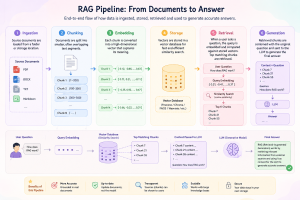
Before getting into the fix, it helps to lay out the standard RAG architecture, since the visualizer is built directly on top of it rather than replacing it:
- Ingestion — source documents (PDF, DOCX, TXT, Markdown, etc.) are loaded from a folder or storage location.
- Chunking — each document is split into smaller, often overlapping, text segments so that retrieval can work at a fine-grained level instead of matching whole documents.
- Embedding — every chunk is passed through an embedding model, which converts the text into a high-dimensional numeric vector that captures its meaning.
- Storage — traditionally, those vectors are pushed into a vector database (Pinecone, Chroma, FAISS, etc.) for fast lookup later. This is the step where visibility is usually lost.
- Retrieval — when a user asks a question, the query itself is embedded, compared against every stored vector using a similarity metric such as cosine similarity, and the closest matching chunks are pulled back.
- Generation — the retrieved chunks are stitched together with the original question and handed to the LLM, which uses them as grounding context to produce the final answer.
Every one of those six steps still happens in our system. What we changed is the storage and retrieval layer, and, more importantly, we made every step of it visible.
Fig. 0 — Infographics of RAG model architecture and working
Our solution: rag-visualizer
Instead of pushing embeddings into a vector database and querying it blindly, rag-visualizer keeps the entire pipeline in memory and renders it as a live, interactive 2D graph in the browser:
documents → chunks → embeddings → in-memory graph (nodes + edges) → 2D visualization
The backend (FastAPI) handles ingestion, chunking, embedding, and similarity computation, then exposes the result as a graph structure. The frontend (React + a force-directed graph library) turns that structure into something a person can actually explore: each chunk becomes a node, colored by its source document; each edge represents similarity between two chunks, with thickness mapped to how strong that similarity is; and node size reflects how connected a chunk is to the rest of the data. Chunks that are heavily related — even across completely different files — get pulled together into a shaded “cloud” and automatically labeled with a category derived from their most frequent shared keywords, no LLM required.
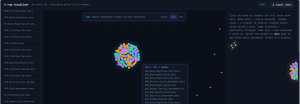
Fig. 1 — After running “$ ingest /data”, every chunk from the ingested documents is plotted as a node. Related chunks pull into shaded cluster clouds, and clicking a node (bottom panel) shows exactly which documents contributed to that cluster — something a raw vector database can never show you at a glance.
One of the most practical wins of dropping the vector database is that the visualizer always knows exactly which source file a chunk came from, so it can hand that file straight back to the user. In a typical RAG setup, retrieving “the document you need” means re-reading chunk text and manually locating the original file. Here, the moment a relevant node is identified, the matching source document is surfaced directly in the UI and can be downloaded on the spot — no digging through the vector store required.
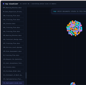
Fig. 2 — A relevant node is selected and its source document is immediately available to download from the visualizer itself, instead of being pulled indirectly out of a vector database.
The visualizer also supports a document-level search mode. Rather than only searching individual chunks, switching the prompt to “docs” mode lets a user ask which whole documents relate to a keyword. The graph highlights the matching cluster, draws out the connections between the related nodes, and lists every source file tied to that cluster in a side panel — making it obvious not just that documents matched, but how they are related to one another through shared chunks.
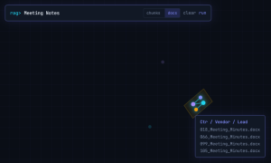
Fig. 3 — Searching “Meeting Notes” in docs mode highlights the connected cluster of chunks and lists the exact documents — 018, 066, 099, and 105 Meeting Minutes — tied together by those internal node connections.
Because everything lives in memory instead of a persistent vector store, every ingest run rebuilds the graph from scratch, so the visualization always matches the current state of the data folder exactly — there is no stale index to worry about, and no separate database to maintain.
Conclusion
The core problem with RAG pipelines has never really been the retrieval logic — it’s the total lack of visibility into what happens between chunking and generation. By replacing the vector database with an in-memory similarity graph and rendering it as an interactive, force-directed visualization, rag-visualizer turns that black box into something a person can actually look at, click through, and reason about. Clusters reveal which parts of a document set are semantically connected, edge thickness makes similarity tangible instead of an invisible float, and both chunk-level and document-level search make it easy to trace exactly why a result showed up. The result is a RAG workflow that is not just functional, but explainable — which is what makes it trustworthy enough to build on.