Introduction/ Issue:
Multi-step forms are common in applications — onboarding flows, surveys, registrations, or wizards. But in Oracle APEX, when you build multi-step forms using multiple regions, the user can easily get confused about where they are in the process. The default design doesn’t show progress, and with multiple stacked regions, the screen often becomes long and cluttered with scrollbars.
Why we need to do / Cause of the issue:
Without a clear progress indicator:
- Users don’t know how many steps remain.
- Navigation becomes unintuitive, especially if forms are lengthy.
- The UI looks cluttered with all regions stacked vertically, forcing users to scroll up and down.
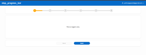
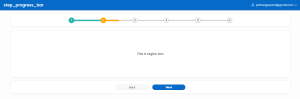
This reduces the overall user experience (UX) and makes the application less elegant. A step progress bar solves this by providing a visual guide, showing the active step and completed steps, while keeping only the relevant region visible.
How do we solve:
I solved this by implementing a custom step progress bar in Oracle APEX using HTML, CSS, and JavaScript.
- Static Region for Progress Bar
- Created a static region with custom HTML defining six steps.
<div id=”progress”>
<div id=”progress-bar”></div>
<ul id=”progress-num”>
<li class=”step active last-active”>1 <span class=”in-progress”></span></li>
<li class=”step”>2 <span class=”in-progress”></span></li>
<li class=”step”>3 <span class=”in-progress”></span></li>
<li class=”step”>4 <span class=”in-progress”></span></li>
<li class=”step”>5 <span class=”in-progress”></span></li>
<li class=”step”>6 <span class=”in-progress”></span></li>
</ul>
</div>
-
- Marked the first step as active.
- Step Regions
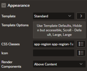
- I created six regions below the progress bar, one for each step. Each region was assigned CSS classes like spp-region, along with a step-specific class such as spp-region-1for the first region, spp-region-2 for the second, and so on up to spp-region-n. Only the region with the active class is visible to the user, and at any given time, this class is applied to just one region.
- Only the current step’s region is visible at a time.
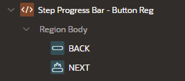
3. Navigation Buttons
-
- Added Nextand Back buttons at the bottom.
- On button click, JavaScript updates which region is visible and adjusts the progress bar (marking the current step as active).
- The BACK button will have the static ID ofprogress-prev and the NEXT button will have the static ID of progress-next.
4. CSS & JavaScript Enhancements
-
- CSS styles the progress bar with active/inactive states.
- JavaScript dynamically updates the active step and hides/shows the correct region.
This creates a smooth transition and eliminates the need for vertical scrolling.
CSS:
@import url(‘https://fonts.googleapis.com/css2?family=Poppins:ital,wght@0,100;0,200;0,300;0,400;0,500;0,600;0,700;0,800;0,900;1,100;1,200;1,300;1,400;1,500;1,600;1,700;1,800;1,900&display=swap’);
*{
font-family: “Poppins”, sans-serif;
}
.t-Region-body {
display: flex;
justify-content: center;
}
#progress {
position: relative;
width:60%;
}
#progress-bar {
position: absolute;
background: lightseagreen;
box-shadow: 0 0 3px lightseagreen, 0 0 0px lightseagreen, 0 0 0px lightseagreen;
height: 5px;
width: 0%;
top: 50%;
left:0;
transform: translateY(-50%);
z-index: 100;
}
#progress-num {
margin: 0;
padding: 0;
list-style: none;
display: flex;
justify-content: space-between;
}
#progress-num::before {
content: “”;
background-color: lightgray;
position: absolute;
top: 50%;
left: 0;
height: 5px;
width: 100%;
z-index: 10;
transform: translateY(-50%);
}
#progress-num .step {
border: 3px solid lightgray;
border-radius: 100%;
width: 25px;
height: 25px;
//background-color:grey;
line-height: 25px;
text-align: center;
background-color: #fff;
font-family: sans-serif;
font-size: 14px;
position: relative;
z-index: 100;
display: flex;
align-items: center;
justify-content: center;
}
#progress-num .step.active {
border-color: lightseagreen;
background-color: lightseagreen;
color: #fff;
box-shadow: 0 0 3px lightseagreen, 0 0 0px lightseagreen, 0 0 0px lightseagreen;
}
#step-progress-bar .t-Region-body:has(#progress){
display:flex;
justify-content:center;
}
#progress-num li.step.active.last-active{
background-color: orange;
border: orange;
box-shadow: 0 0 3px orange, 0 0 0px orange, 0 0 0px orange;
}
#progress-num li.step.active.last-active .in-progress{
height: 5px;
position: absolute;
top: 50%;
left: 25px;
background-color: orange;
z-index: 500;
transform: translateY(-50%);
border-radius: 0 1rem 1rem 0;
box-shadow: 0 0 3px orange, 0 0 0px orange, 0 0 0px orange;
}
/* Button Reg */
#spp-btn-reg{
display: flex;
justify-content: center;
align-items: center;
}
#spp-btn-reg button{
width: 150px;
height: 25px;
display: flex;
flex-direction: column;
align-items: center;
}
.spp-region{
display: none;
padding: 5rem;
}
.spp-region.active{
display: block;
}
Javascript:
function getHalfDistanceBetweenSteps(){
let $steps = $(‘#progress-num .step’);
let firstOffset = $steps.eq(0).offset().left;
let secondOffset = $steps.eq(1).offset().left;
let distance = secondOffset – firstOffset;
let halfDistance = (distance – 25) / 2;
return halfDistance + ‘px’;
}
$(‘.step’).eq(0).find(‘.in-progress’).css(‘width’, getHalfDistanceBetweenSteps());
const progressNext = document.getElementById(“progress-next”);
const progressPrev = document.getElementById(“progress-prev”);
const progressBar = document.getElementById(“progress-bar”);
progressPrev.disabled = true;
const steps = document.querySelectorAll(“.step”);
const sppRegions = document.querySelectorAll(“.spp-region”);
let active = 1;
progressNext.addEventListener(“click”, () => {
active++;
if (active > steps.length) {
active = steps.length;
}
updateProgress();
});
progressPrev.addEventListener(“click”, () => {
active–;
if (active < 1) {
active = 1;
}
updateProgress();
});
const updateProgress = () => {
sppRegions.forEach(function(region, i){
if((active-1) === i) {
region.classList.add(‘active’);
}
else region.classList.remove(‘active’);
})
// toggle active class on list items
steps.forEach((step, i) => {
if (i < active) {
step.classList.add(“active”);
if(i == active-1) {
step.classList.add(“last-active”)
}
else {
step.classList.remove(“last-active”);
}
} else {
step.classList.remove(“active”);
}
});
progressBar.style.width = ((active – 1) / (steps.length – 1)) * 100 + “%”;
// enable disable prev and next buttons
if (active === 1) {
progressPrev.disabled = true;
progressNext.disabled = false;
} else if (active === steps.length) {
progressPrev.disabled = false;
progressNext.disabled = true;
} else{
progressPrev.disabled = false;
progressNext.disabled = false;
}
$(‘#progress-num li.step’).each(function(i,step){
if($(this).hasClass(‘active’) && $(this).hasClass(‘last-active’)){
if(i == steps.length – 1){
$(this).find(‘.in-progress’).css(
‘width’,’0px’
)
}else{
$(this).find(‘.in-progress’).css(
‘width’,getHalfDistanceBetweenSteps()
)
}
}else{
$(this).find(‘.in-progress’).css(
‘width’,’0px’
)
}
})
};
Conclusion:
By combining a simple HTML structure, custom CSS, and JavaScript logic, I was able to transform a multi-step form into a clean wizard-like UI in Oracle APEX.
- The progress bartells users exactly where they are.
- The Next/Back navigationmakes the form intuitive.
- The elimination of scrollbarscreates a modern, elegant look.
This approach improves usability and user confidence, especially for forms with many steps. It shows that with a little customization, Oracle APEX can deliver not just functionality, but also a polished user experience.