INTRODUCTION:
In Oracle APEX 19.2, Donut charts are commonly used to represent proportional data in a visually appealing way. While the chart effectively displays individual segment values, there is no built-in option to show a total value at the center of the donut chart. This limitation makes it difficult for users to quickly understand the overall total represented by the chart.
WHY WE NEED TO DO:
By default, Oracle APEX JET Donut charts focus on displaying series values through legends and tool-tips. However:
- Business users often want to see the overall total at a glance
- The center space of a donut chart is unused by default
- Oracle APEX 19.2 does not provide a declarative property to display a center total
As a result, users must calculate the total manually or rely on external labels, which reduces usability and dashboard clarity.
HOW DO WE SOLVE:
Write the Query or the steps to solve the issue with your real-time example or scenarios.
- Calculating the total value of all donut chart segments using dataFilter
- Storing the calculated total in a custom option variable
- Rendering a custom HTML element at the center of the donut using pieCenter.renderer
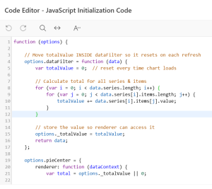
JAVASCRIPT INITIALIZATION CODE:
function (options) {
// Reset and calculate total value on every chart refresh
options.dataFilter = function (data) {
var totalValue = 0;
// Loop through series and items to calculate total
for (var i = 0; i < data.series.length; i++) {
for (var j = 0; j < data.series[i].items.length; j++) {
totalValue += data.series[i].items[j].value;
}
}
// Store total value for renderer usage
options._totalValue = totalValue;
return data;
};
// Render total value in the center of the donut chart
options.pieCenter = {
renderer: function (dataContext) {
var total = options._totalValue || 0;
var pieElem = document.createElement(‘div’);
pieElem.innerHTML =
‘<div style=”position:absolute; text-align:center; font-family: Arial Black; font-size:12px;”>100% (‘ + total + ‘)</div>’;
var outerDiv = pieElem.children[0];
var innerBounds = dataContext.innerBounds;
outerDiv.style.top = innerBounds.y + “px”;
outerDiv.style.left = innerBounds.x + “px”;
outerDiv.style.height = innerBounds.height + “px”;
outerDiv.style.width = innerBounds.width + “px”;
outerDiv.style.lineHeight = innerBounds.height + “px”;
return pieElem;
}
};
return options;
}
REAL-TIME SCENARIO:
Example: Total Rework and Rejection Quantity by Customer
In this scenario, a Donut chart is used to represent Rework and Rejection quantities. Using the JavaScript Initialization Code shown above:
- The chart dynamically calculates the total value (69) by summing all segment values
- The calculated total is displayed at the center of the donut as 100% (69)
- Each slice shows its percentage and value:
- Rejection: 70% (48)
- Rework: 30% (21)
This ensures that users can quickly understand both the distribution and the overall total without referring to external labels or reports.
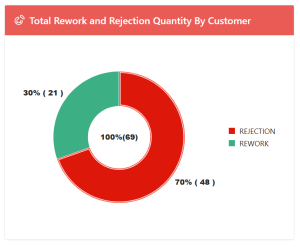
Donut chart with Center total value
CONCLUSION:
By leveraging JavaScript Initialization Code in Oracle APEX 19.2, we can effectively enhance the Donut chart by displaying a dynamic total value at its center. This solution:
- Improves dashboard readability
- Uses the unused center space efficiently
- Automatically recalculates totals on chart refresh
- Works without exposing sensitive or customer-specific information
This approach provides a simple yet powerful enhancement to Oracle APEX Donut charts, delivering a better user experience with minimal customization.