INTRODUCTION:
In Oracle APEX 19.2, Pie charts are widely used to visualize proportional data. However, the default 2D Pie chart sometimes lacks visual depth, especially when displaying many categories. Business users often expect a more visually rich chart, such as a 3D Pie chart, but Oracle APEX does not provide a declarative option to enable this directly.
WHY WE NEED TO DO:
The standard Pie chart in Oracle APEX:
- Uses a default color palette limited to 5 colors
- Repeats the same colors when the number of slices exceeds the default limit (for example, 10 or more slices)
- Makes it difficult to visually distinguish slices when multiple categories are present
- Appears flat and less impactful in management dashboards
Because of these limitations, charts with many slices become confusing and less readable. To improve clarity and presentation quality, we need to:
- Apply a custom color palette to avoid color repetition
- Enable a 3D effect to add visual depth
HOW DO WE SOLVE:
We can convert a standard Pie chart into a 3D Pie chart by using JavaScript Initialization Code in the chart attributes. The solution includes:
- Applying a custom color palette for better slice distinction
- Assigning colors consistently to both legend and pie slices
- Enabling the threeDEffect property through chart style defaults
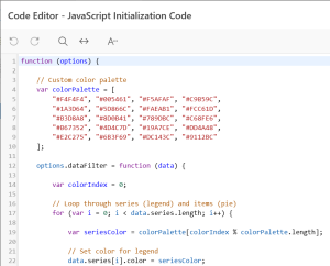
JAVASCRIPT INITIALIZATION CODE:
function (options) {
// Custom color palette
var colorPalette = [
“#F4F4F4”, “#005461”, “#F5AFAF”, “#C9B59C”,
“#1A3D64”, “#5D866C”, “#FAEAB1”, “#FCC61D”,
“#B3D8A8”, “#8D0B41”, “#789DBC”, “#C68FE6”,
“#B67352”, “#4D4C7D”, “#19A7CE”, “#DD4A48”,
“#E2C275”, “#6B3F69”, “#DC143C”, “#9112BC”
];
options.dataFilter = function (data) {
var colorIndex = 0;
// Loop through series (legend) and items (pie slices)
for (var i = 0; i < data.series.length; i++) {
var seriesColor = colorPalette[colorIndex % colorPalette.length];
// Set color for legend
data.series[i].color = seriesColor;
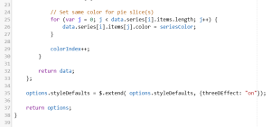
// Set same color for pie slice(s)
for (var j = 0; j < data.series[i].items.length; j++) {
data.series[i].items[j].color = seriesColor;
}
colorIndex++;
}
return data;
};
// Enable 3D effect for Pie chart
options.styleDefaults = $.extend(
options.styleDefaults,
{ threeDEffect: “on” }
);
return options;
}
REAL-TIME SCENARIO:
In a report showing Overall Rework Quantity by Customer, multiple customers contribute varying quantities. Converting the Pie chart to a 3D Pie chart:
- Improves visual depth and readability
- Makes high-contributing customers stand out
Enhances presentation quality for management dashboards
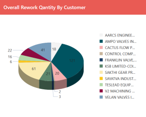
Pie Chart with Custom Color & 3D Effect
CONCLUSION:
By leveraging JavaScript Initialization Code in Oracle APEX 19.2, we can successfully convert a standard Pie chart into a visually appealing 3D Pie chart. This approach:
- Adds depth without changing the data model
- Works seamlessly with existing Pie charts
- Improves user engagement and dashboard clarity
This solution provides an effective way to enhance chart visualization in Oracle APEX where declarative options are limited.