
Introduction
Oracle APEX 26.1 brought in a new template component called the Metric Card, purpose built for KPI style dashboards. Until this release, if you wanted a clean tile showing a single important number, you had to either write custom HTML or stretch a regular Cards region with heavily customized templates just to make it look like a metric tile. Now, it’s a proper first-class component with its own dedicated slots and layout options no more reinventing the wheel every time someone asks for a “numbers at a glance” screen.
Why We Need This
Before Oracle APEX 26.1, developers had to use custom HTML, CSS, or modify regular Cards to display KPI metrics, which increased development effort and resulted in inconsistent designs across applications. The Metric Card solves this by providing a built-in, optimized component for displaying key metrics with a consistent, professional appearance, reducing maintenance and eliminating the need for extensive custom styling.
How We Solve It
The Metric Card is a dedicated component for displaying Key Performance Indicators (KPIs) in a clean and visually appealing format. It organizes information into three main sections:
- Title – Displays the name or label of the metric, such as a department, region, or product.
- Metric – Displays the primary value or KPI in a large, prominent format to attract the user’s attention.
- Meta – Displays additional information related to the metric, such as counts, percentages, averages, or other supporting details.
The Metric Card also provides Layout options that allow developers to arrange these sections in different ways based on the dashboard design. If further customization is required, optional CSS classes can be applied to modify the appearance while still using the built-in component.
Example: Department-wise metrics from the EMP table
Query aggregated by department:
SELECT d.deptno, d.dname,
count(*) as emp_count,
sum(e.sal) as total_sal,
round(avg(e.sal),2) as avg_sal
from emp e
join dept d
on e.deptno = d.deptno
group by d.deptno, d.dname
Metric Card field configuration:
Field Value
Title Department &.DNAME
Metric &Total_sal
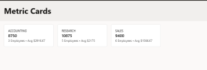
Meta &EMP_COUNT. employees · Avg $&AVG_SAL.
Layout Default
Running this produces one card per department department name as the label, total salary as the headline figure, and employee count plus average salary as the supporting text underneath. Because the query drives the cards, adding a new department to the table means a new card appears automatically no page design changes needed.
Where This Fits in a Real App
A few practical places Metric Cards tend to work well:
- Executive summary rows, at the top of a dashboard page total sales, active users, open tickets, all in one horizontal strip.
- Perentity breakdowns, like the department example above, where each row of an aggregate query becomes its own tile.
- Status overviews, pairing a count (Metric) with a category label (Title) and a short description (Meta), such as “Pending Orders” with a count and an average processing time.
- Comparison dashboards, where Layout options let you place several Metric Cards side by side so users can scan values quickly without scrolling through a report.
Styling and Customization Options
Beyond the three core slots, the Metric Card gives you room to make each tile fit your app’s design language. The optional CSS classes on Title, Metric, and Meta mean you can apply color coding without touching the template itself for instance, a red accent class on the Metric text when a value crosses a threshold, or a muted gray on Meta text to keep it visually secondary to the headline number.
Because it’s built on the Universal Theme, Metric Cards also respond naturally to your app’s active theme roller settings, so switching between light and dark modes, or applying a custom theme style, doesn’t require extra rework on your end. This is a meaningful difference from hand-built HTML tiles, which often need manual theme-awareness baked in.
If your dashboard needs icons alongside each metric a small up/down arrow for trend direction, or a category icon these can be added through the CSS classes on Title or Meta using icon font classes, keeping everything declarative rather than requiring inline HTML.
Output
Conclusion
The Metric Card removes the guesswork from building KPI tiles in APEX. Instead of stitching together custom regions and CSS, you get a purpose made component with clear slots for title, number, and context making dashboards faster to build, easier to keep visually consistent, and simpler to hand off to other developers on the team. Whether you’re building a single executive summary row or a full grid of per-entity metrics, this component cuts out a lot of repetitive setup that used to be part of every dashboard build. For anyone working on admin dashboards or reporting screens in APEX 26.1, it’s a small feature that pays for itself quickly.
