Introduction:
Oracle APEX introduced a built-in “Cards” region type in later versions, but in version 19.2, there’s no direct option to create dashboard cards out-of-the-box. I needed to create a dashboard for the pending tasks.
The requirement was:
- Show each task in a card layout.
- Count the total number of pending and completed tasks.
- Display counts with color coding — green for “0 pending” and red if there are pending tasks.
- Show an overall summary in a bar chart above the cards.
Why we need to do:
In Oracle APEX 19.2:
- The built-in “Cards” template is not available as a region type.
- Task statuses (pending/completed) needed to be highlighted for quick team visibility.
- Management wanted a visual summary bar showing how many tasks were completed and how many were pending without opening detailed reports.
If we didn’t implement this customization:
- Users would have to navigate through tabular reports to get status updates.
- There would be no quick visual clue for task urgency.
How do we solve:
1. Create a Classic Report Region for Cards:
- Create a Classic Report in your dashboard page.
- Configure the card title, subtitle, and description columns based on your table/query.
- Go to Attributes → Template and select Cards.
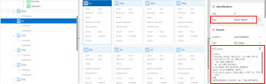
Create a Classic Report and write an SQL query for Cards based
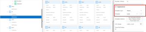
Set Template to “Cards”
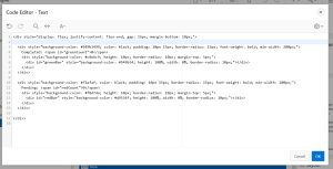
2. Add a Static Region Above the Cards:
- This will hold the Pending and Completed task counts along with a bar indicator.
- Static Region HTML:
<div style=”display: flex; justify-content: flex-end; gap: 15px; margin-bottom: 10px;”>
<div style=”background-color: #549b3499; color: black; padding: 10px 15px; border-radius: 15px; font-weight: bold; min-width: 200px;”>
Completed: <span id=”greenCount”>0</span>
<div style=”background-color: #c8e6c9; height: 10px; border-radius: 10px; margin-top: 5px;”>
<div id=”greenBar” style=”background-color: #549b34; height: 100%; width: 0%; border-radius: 10px;”></div>
</div>
</div>
<div style=”background-color: #f2afaf; color: black; padding: 10px 15px; border-radius: 15px; font-weight: bold; min-width: 200px;”>
Pending: <span id=”redCount”>0</span>
<div style=”background-color: #f8d7da; height: 10px; border-radius: 10px; margin-top: 5px;”>
<div id=”redBar” style=”background-color: #d9534f; height: 100%; width: 0%; border-radius: 10px;”></div>
</div>
</div>
</div>
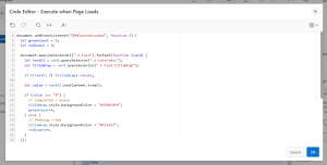
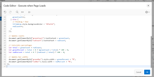
3. Apply Color Coding & Count Logic in Page Load:
- In your Page Load JavaScript, add:
document.addEventListener(“DOMContentLoaded”, function () {
let greenCount = 0;
let redCount = 0;
document.querySelectorAll(“.t-Card”).forEach(function (card) {
let textEl = card.querySelector(“.t-Card-desc”);
let titleWrap = card.querySelector(“.t-Card-titleWrap”);
if (!textEl || !titleWrap) return;
let value = textEl.textContent.trim();
if (value === “0”) {
// Completed → Green
titleWrap.style.backgroundColor = “#549b3499”;
greenCount++;
} else {
// Pending → Red
titleWrap.style.backgroundColor = “#f2afaf”;
redCount++;
}
});
// Update counts
document.getElementById(“greenCount”).textContent = greenCount;
document.getElementById(“redCount”).textContent = redCount;
// Calculate percentages
let total = greenCount + redCount;
let greenPercent = total > 0 ? (greenCount / total) * 100 : 0;
let redPercent = total > 0 ? (redCount / total) * 100 : 0;
// Update bar widths
document.getElementById(“greenBar”).style.width = greenPercent + “%”;
document.getElementById(“redBar”).style.width = redPercent + “%”;
});
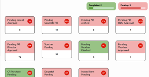
4. Screenshots for Visual Understanding:
- Cards with 0 pending tasks → green header, Cards with pending tasks → red header.
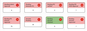
- Summary bar above cards showing completed vs pending Counts.
Conclusion:
By converting a Classic Report into Cards and applying CSS for status color coding, we recreated a modern card-style dashboard in Oracle APEX 19.2. Adding a summary bar gives managers instant visibility into workload status without drilling down. This approach works well for older APEX versions where “Cards” aren’t available as a native region type.